Accessibility Considerations
About the module
This module explains the importance of accessibility and provides key practices to follow to ensure that your website remains accessible to all users.
What is accessibility?
Accessibility is the practice to make a product or service usable and meaningful to as many people as possible, in whichever ways they encounter it.
Think about it this way, if you have a physical store, you would want to ensure that customers using mobility devices like wheelchairs can enter and browse easily on their own. As much as possible, their experience should not be limited due to their disability.
This idea of accessibility should apply to your website as well. Whether it is making information simple for new users to understand, or including captions in videos for hearing-impaired users, we want to make sure that all users easily use our websites.
Why should we care about accessibility?
As government organisations designing websites for citizens, we have to ensure that none of our users are left behind, as these platforms are an important source of official information that many of them rely on. Our websites should be accessible to everyone, regardless of age, technological literacy, or physical abilities.
Guidelines for accessibility
Consider all users
When designing your website, it is important to consider all types of users, including:
-
users with disabilities (e.g. audio, visual, and motor impairments)
-
users with a lower literacy level and only a basic understanding of English
-
users with different devices (e.g. mobile or tablet)
Check out gov.uk’s article on specific accessibility considerations for different types of users.
Use plain language
Avoid overly complicated phrasings or technical jargon as it might confuse your users. Your content should be easy to read and understand by as many users as possible.
Make use of online tools such as the Hemingway app to check the readability of your texts. Aim for at least Grade 9 or lower!
Conduct a quick test with users on whether they can easily understand your content and revise your copy before publishing.
Keep texts easy to read
Break large chunks of text into shorter paragraphs and concise sentences.
Include images, videos, or illustrations to provide visual context and explanation to your texts.
Make use of headings, list formatting, bolding, and hyperlinks.
Add alt-text for images
Alt-text is a written copy that shows when an image does not load. It also helps describes images for screen readers.
Ensure that all non-text items have an alt-text so that visually-impaired users can understand them through a screen reader.
For example, the alt-text for the following image below could be “Team from Open Government Products interacting with participants during a design workshop”

Ensure proper color contrast
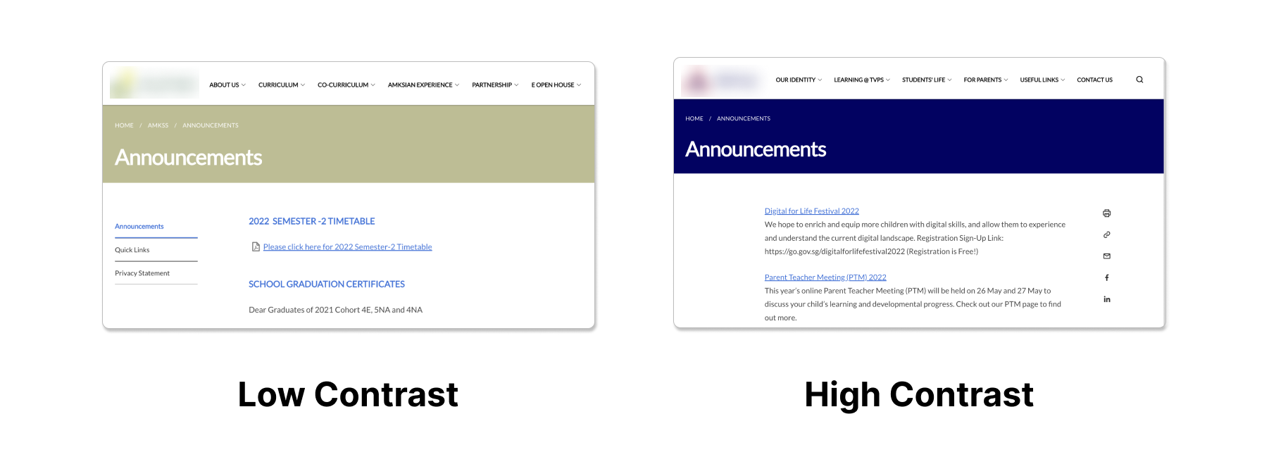
Check that your site colors are selected to have sufficient contrast against your texts as it impacts the visibility of texts on your website. This is especially important to help visually impaired users read your texts.
Compare both examples below, the header text with high contrast is much easier to see than the one with low contrast.

Hero banner images have a default dark overlay when uploaded to maintain proper color contrast that adheres to accessibility standards.
Avoid flashing content
Take note that uploading media with multiple flashes or rapid colors may cause seizures and be uncomfortable to view.
Use headings to structure content
As covered in the text content design, using headings to outline and group different sections of a page helps improve readability.
More importantly, headings act as a navigation method for screen reader users. For example, when the screen reader detects an H2 heading, it allows the users to navigate between other H2 headings of that section, similar to how users would scan a page.
Text alternatives for videos and podcasts
Provide captions to audio-visual content (e.g. videos) and text transcripts to audio content (e.g. podcasts).
Descriptive names for buttons and links
Descriptive names for buttons and links are also important from an accessibility standpoint. Screen readers often navigate from link to link and skip surrounding texts, which causes their users to miss out on contextual information.
Having descriptive names on these links helps to provide better context on where it leads to.
The example below shows how a screen reader user navigates without context compared to a normal user.


