Homepage Design
About the module
This module touches on the importance of a website homepage, examples of good website homepages, and best homepage practices.
Importance of a homepage
The homepage of your website is likely where most of your users would land first. Their experience on the homepage plays a pivotal role in capturing their attention and engaging them to continue browsing the site.
If you think about your website as a store, your homepage is the storefront window where key items are highlighted for customers to see. Items displayed on the storefront capture the customer’s attention and determine whether they continue to take a look inside or walk away.
Similarly, the homepage is used to introduce useful content (e.g. announcements, events) and lead users to other pages across the site. The homepage should be frequently updated with new features and updates, like how a storefront constantly shows new deals or seasonal items. Wouldn’t it be boring if people always come back to the same content?
How to make your homepage engaging?
From hero banners to infopic sections, Isomer features a variety of homepage templates for users to customise their content. Effective use of images and copywriting also play a key part in making your website stand out.
Take a look at how the following Isomer sites make full use of their homepages:
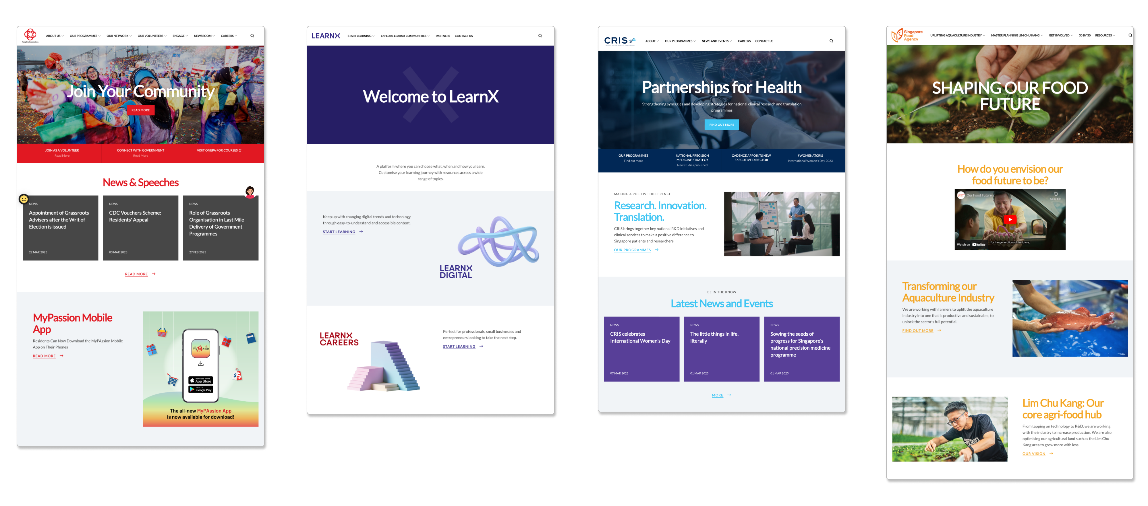 (People’s Association, NLB’s LearnX, CRIS Singapore, Singapore Food Agency)
A common theme surrounding these examples is how they make use of concise copy and relevant images to give users a glimpse into their organisations. Visually captivating hero banners are used to engage audiences right from the start.
Each organisation has a different approach to creating its website. Some use colorful, vivid graphics to convey their identity, while others use immersive, realistic photos to showcase what they do. Even with Isomer’s standard templates, each website managed to craft a unique look that strongly represents its organisation.
Key principles to create an effective homepage
Use images and videos for effective storytelling
- Incorporate visual content such as photos and videos to engage audiences and convey your message. Pair it with relevant copywriting to make your content more interesting and relatable, while showcasing your organisation’s identity.
Help users familiarise themselves
- Ensure that your homepage provides an overview of your website and allows users to navigate to where they need. Categories in the navigation bar and instructions on the homepage should be clear, concise, and intuitive for users.
Keep it updated and fresh
- Frequently update your homepage with new announcements, events, and pictures. Engage users with updates on the latest happenings in your organisation (e.g. events). This informs users that the website is constantly updated, encouraging them to check in often.
Best homepage practices
1. Fully utilise the homepage
Your homepage is more than just the hero banner! Be sure to make use of different homepage sections to convey information creatively.
Make use of features like hero banner highlights, resources section, or even adding videos in the infopic section to provide more variety to your content.
Take a look at how websites like greenplan.gov.sg and switchsg.org make full use of different sections to create and customise informative homepages.
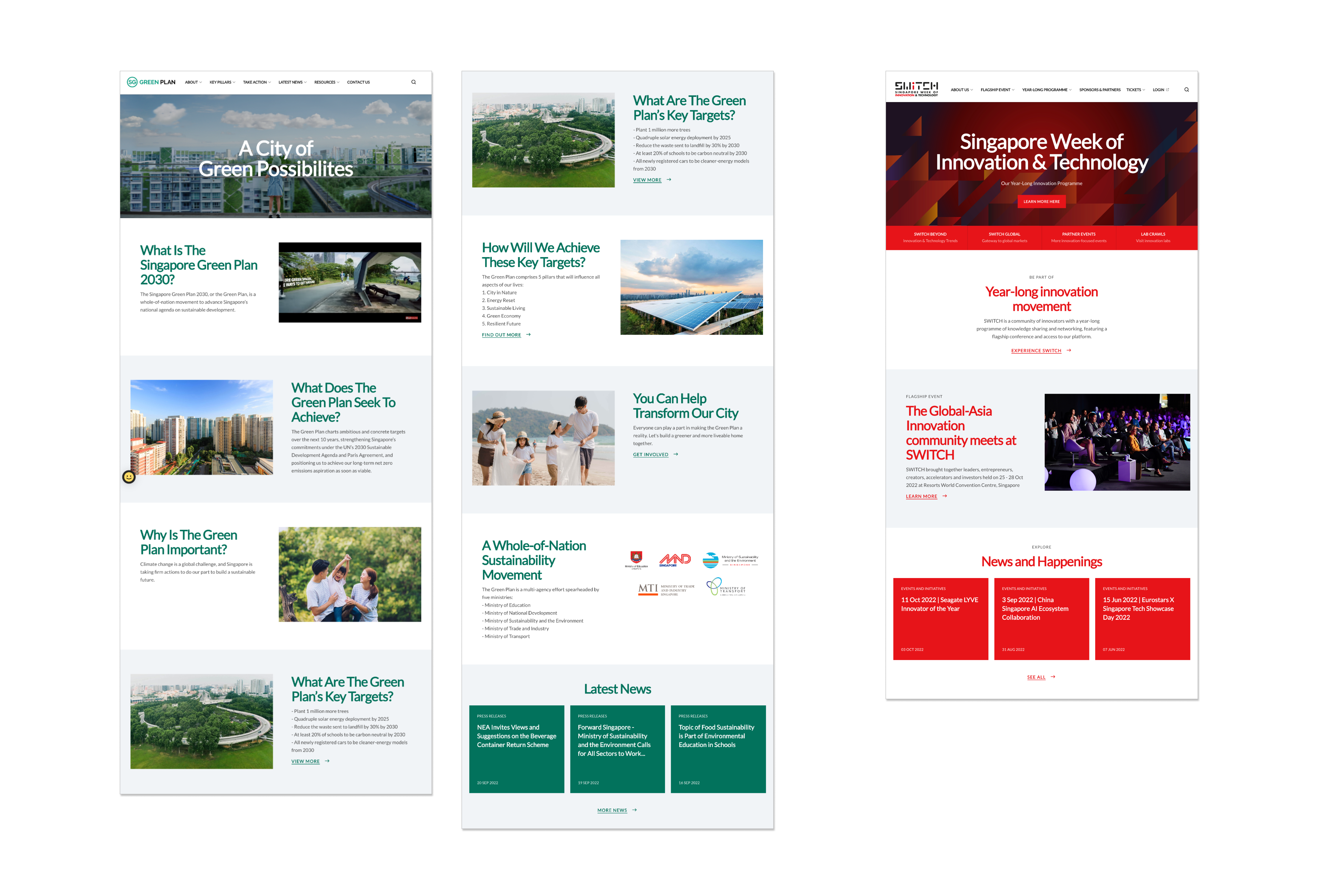
However, keep in mind that placing too many sections (more than 10) could make your homepage too long.
2. Focus on the key information
Refrain from over-cluttering your homepage with information. Having excessive or irrelevant information impedes users from finding what they need.
Instead, highlight what you want to say with a short, concise copy in each homepage section. Save longer details for a separate page instead.
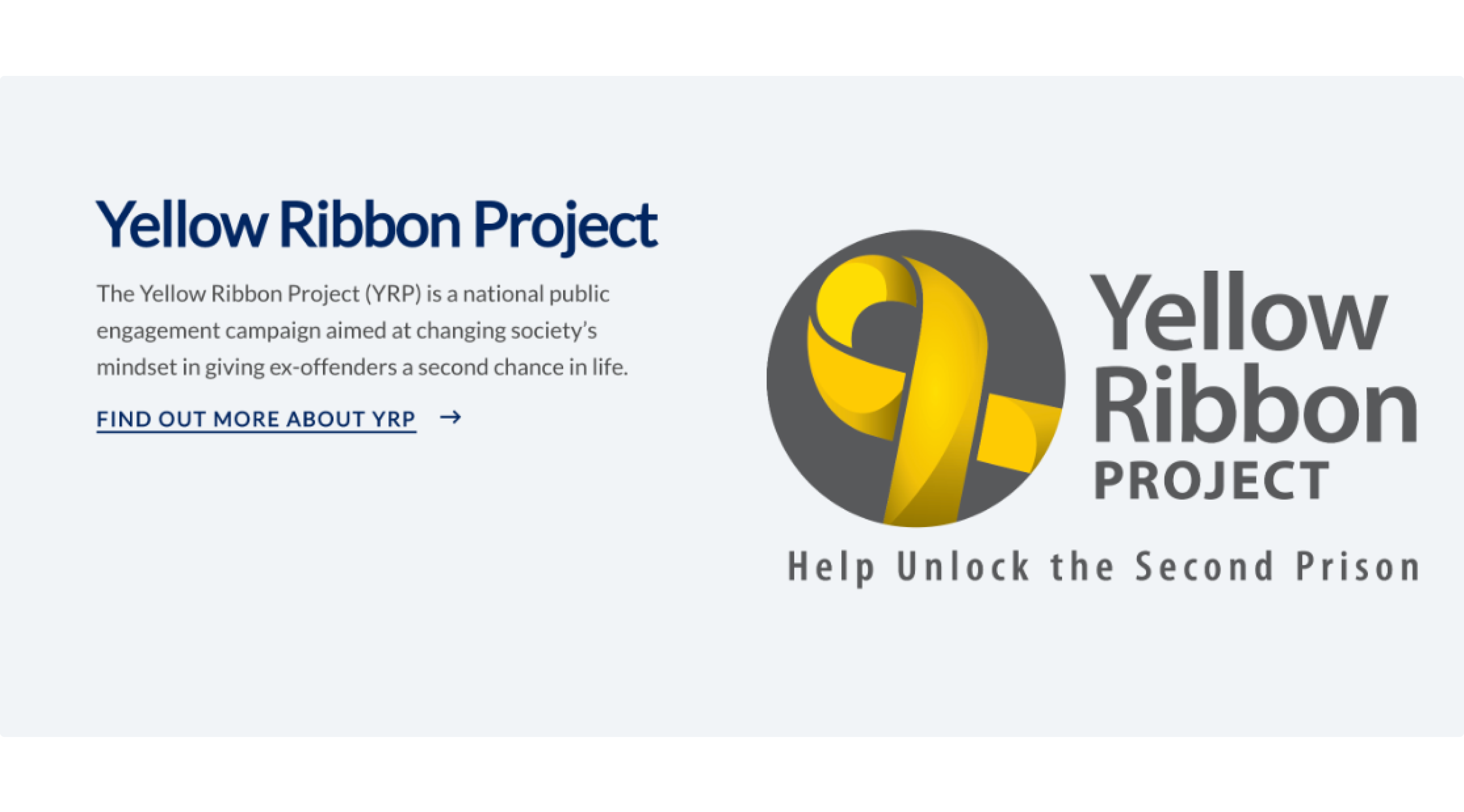
The example below shows how Singapore Prison Service uses a short copy to introduce the Yellow Ribbon project on its homepage, with a separate link for users to find out more if they are interested.
3. Create an effective hero banner
The hero banner is a key aspect of every homepage, as it is the first thing that viewers see. An effective hero banner captures a viewer’s attention and communicates the main message or value proposition of the website. Visuals help to reinforce the message and create an emotional connection with the visitor.
Overall, the hero banner is an important element of a website’s landing page, as it sets the tone for the rest of the page and can have a significant impact on the visitor’s first impression of the website.
Keep your hero banner engaging, relevant, and clear. Use images or colors that strongly represent your brand or values. Make sure both the image and copy are closely aligned with what you want to convey.
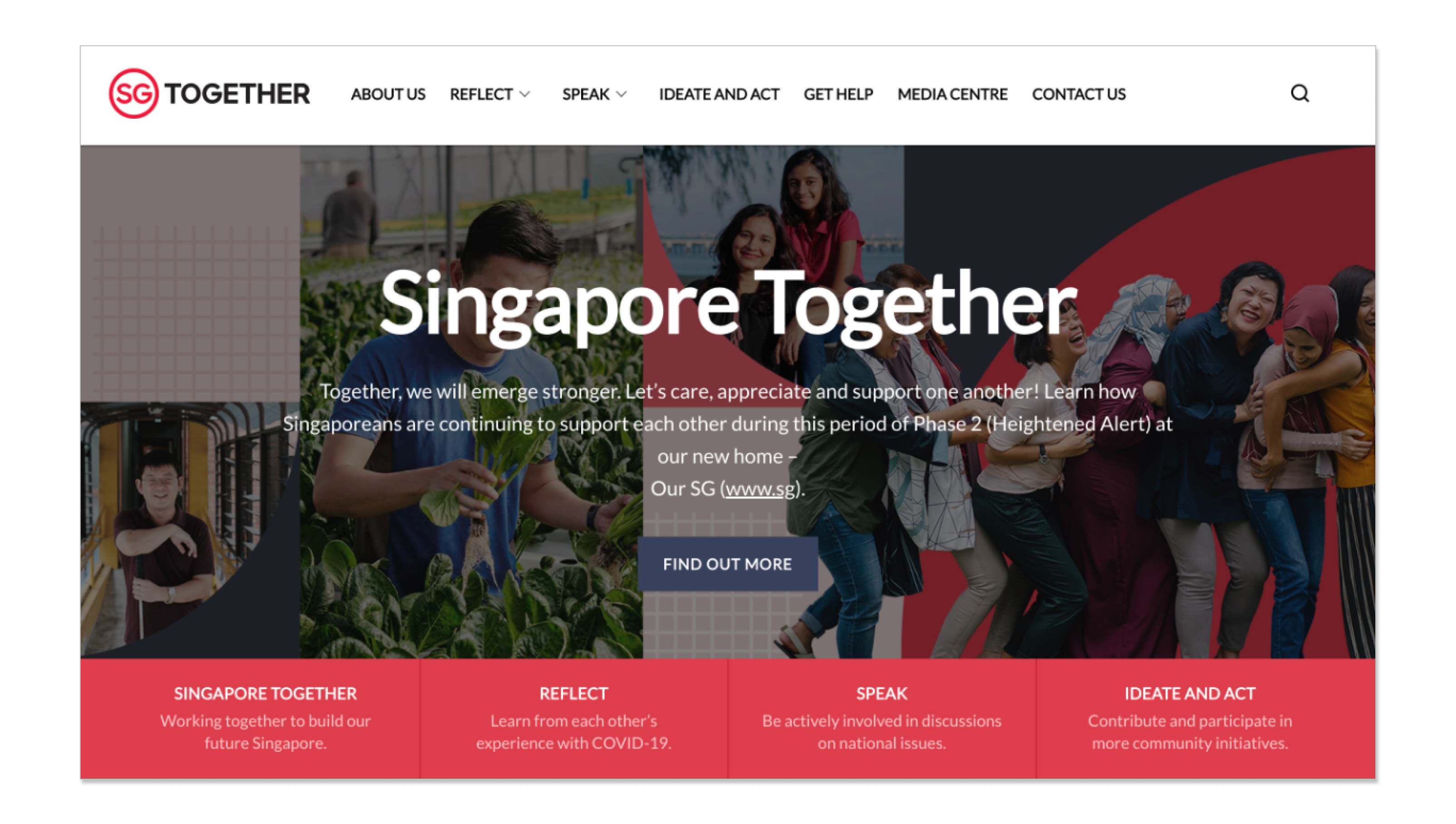
For example, SGTogether uses cheerful images of citizens working together, coupled with matching texts encouraging Singaporeans to support one another through the pandemic.
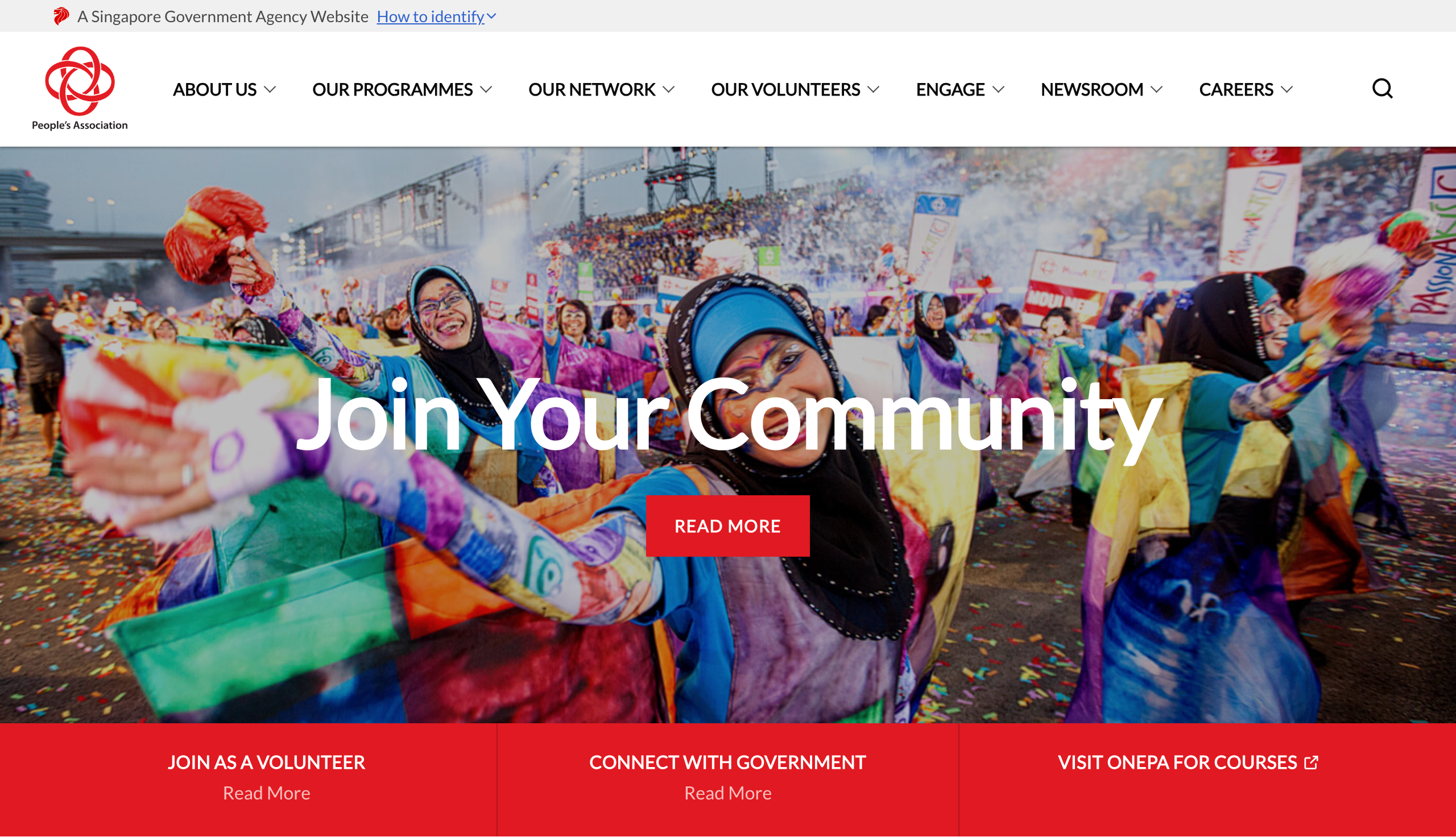
The People’s Association (PA) website uses a vibrant and colorful event photo full of smiling faces to emotionally connect with site visitors. This is combined with a punchy tagline to communicate the value proposition of their services, creating an impactful hero banner.
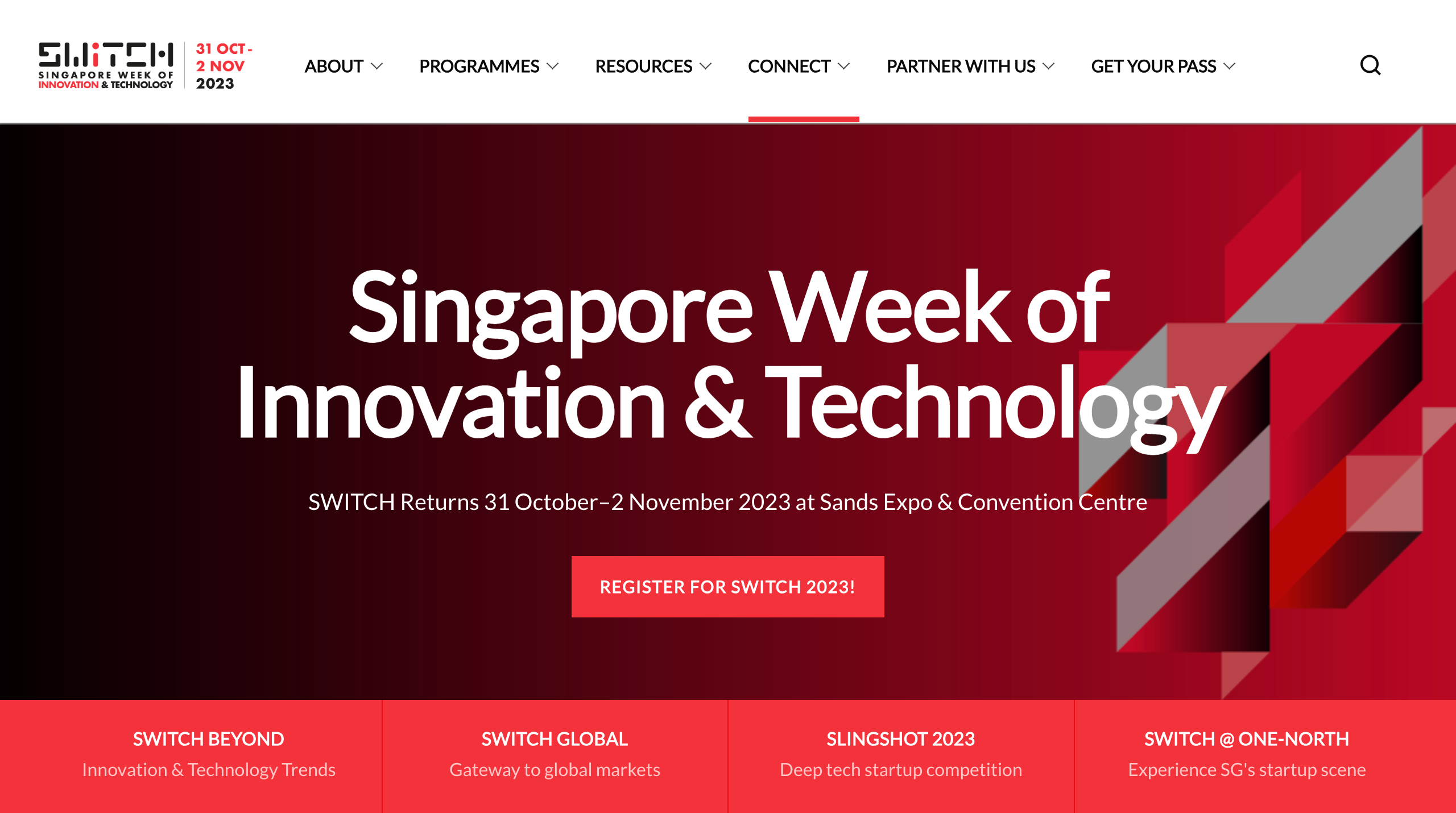
Singapore Week of Innovation & Technology (SWITCH) uses a stylistic patterned graphic for their hero image, which gives a sense of sophistication. They use their Call-To-Action button to prompt site visitors to register for their event.
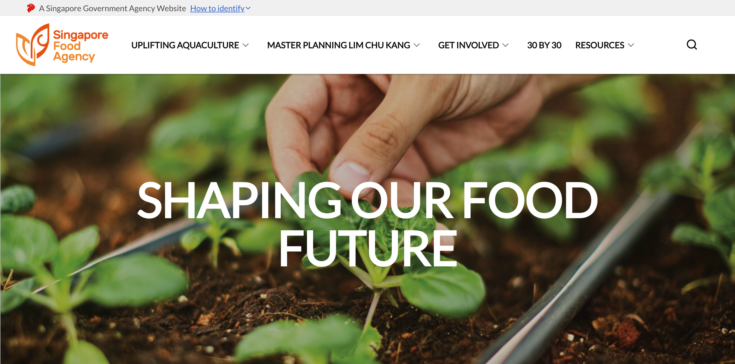
Our Food Future uses a bold image that focuses on a hand, drawing our attention to the action of someone touching a budding plant. This zoom-in focus really drives home their tagline of the importance of food security in Singapore.
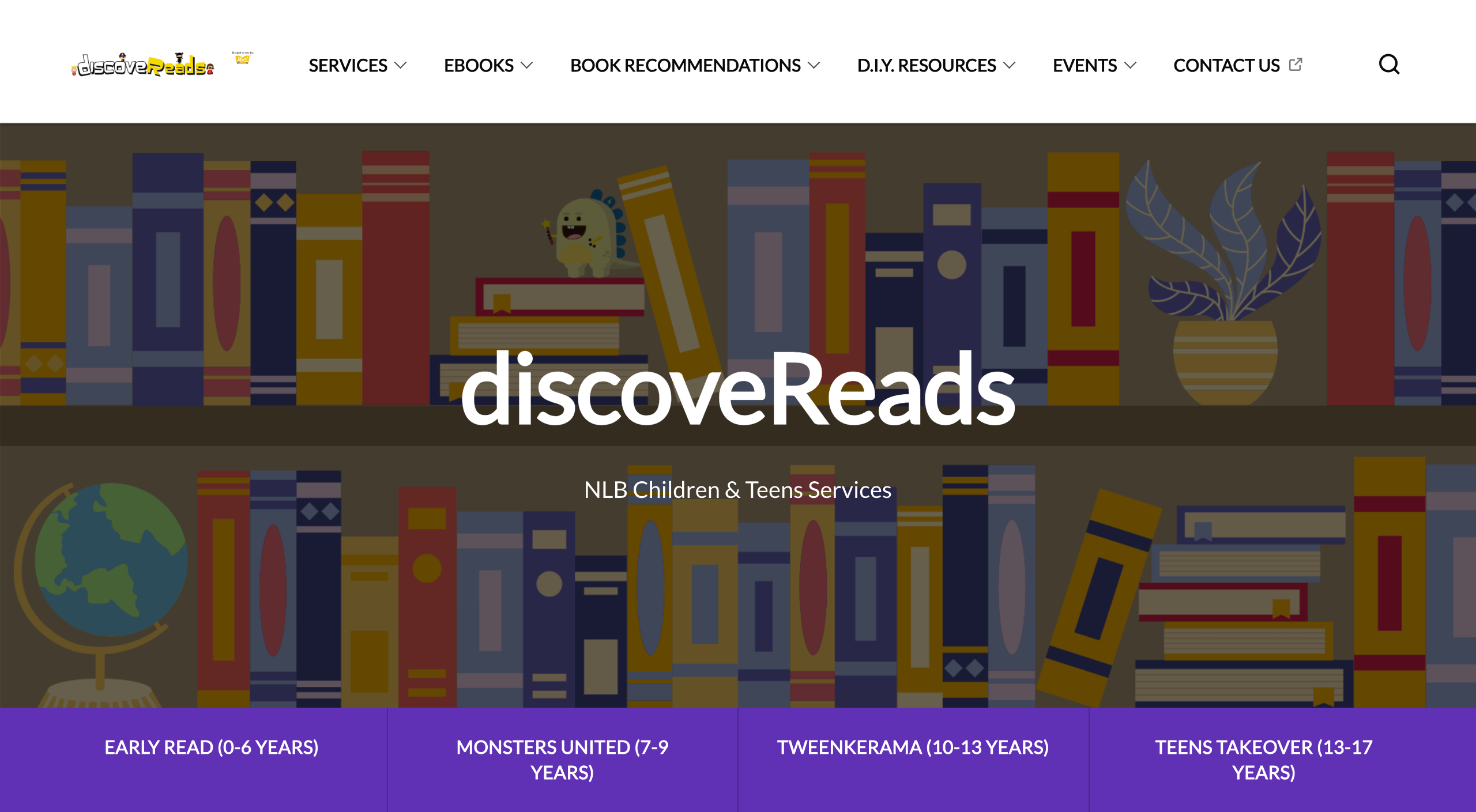
NLB’s DiscoveReads website uses a carton graphic to mimic a bookshelf. The graphic style used fits their target audience, and adds a whimsical and youthful feel to their website.
4. Place effective images
Aside from making your homepage more engaging, using images helps improve a website’s readability as it breaks up large chunks of text and provides complementing visual details.
Avoid using generic stock images that provide little value to viewers. Instead, use images that are relevant to what you are trying to convey, as it helps to provide better context.
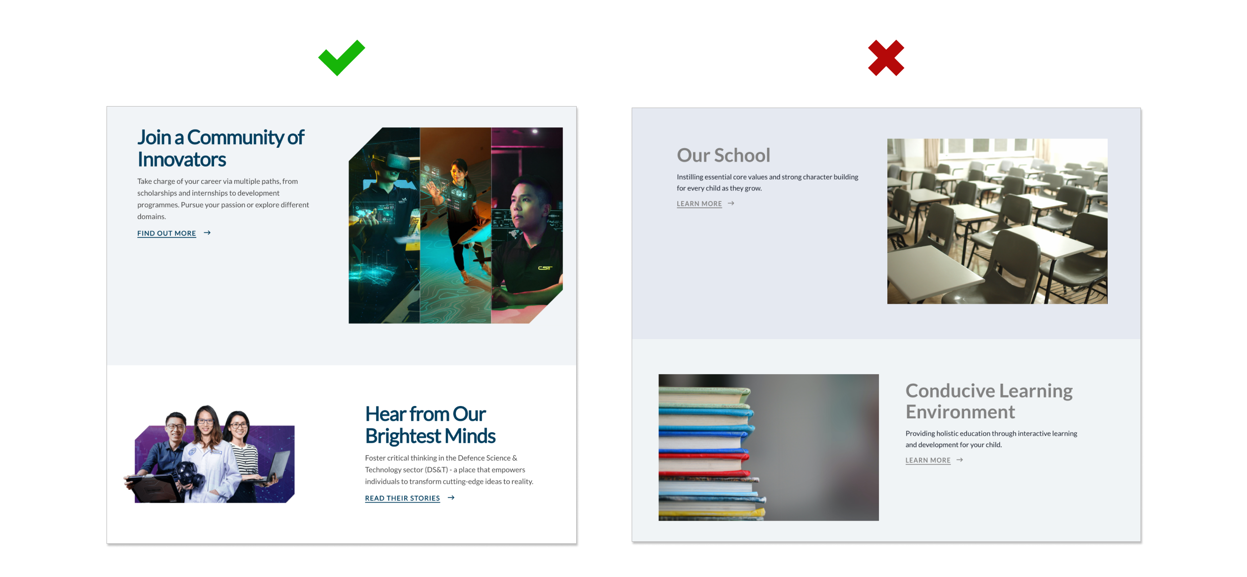
Avoid low-quality images that may look pixelated in larger dimensions. High-quality images better capture your user’s attention and make your website look more professional.

The style of images should remain consistent across the page. For example, graphics used should follow a consistent pattern or color palette.
5. Use effective copywriting
Create copies that are both functional and engaging to get your audience’s attention. Make full use of your title texts to highlight key details or value propositions you want to convey. Think about using creative copies that can influence users to take action.
6. Avoid vague button names
You don’t need to use ‘Click’ or ‘Here’ for your buttons. If a button or link is clickable, that is usually implied visually (e.g. underlined text links or boxes that are clearly buttons).
Instead, use button names that are relevant and descriptive. This provides users with a better context on what to expect when clicking in and acts as a Call-to-Action prompt to garner better engagement.
Start with action words such as read, see, or register. Think about what the user will see after they click the button, and try to convey that in the button text.
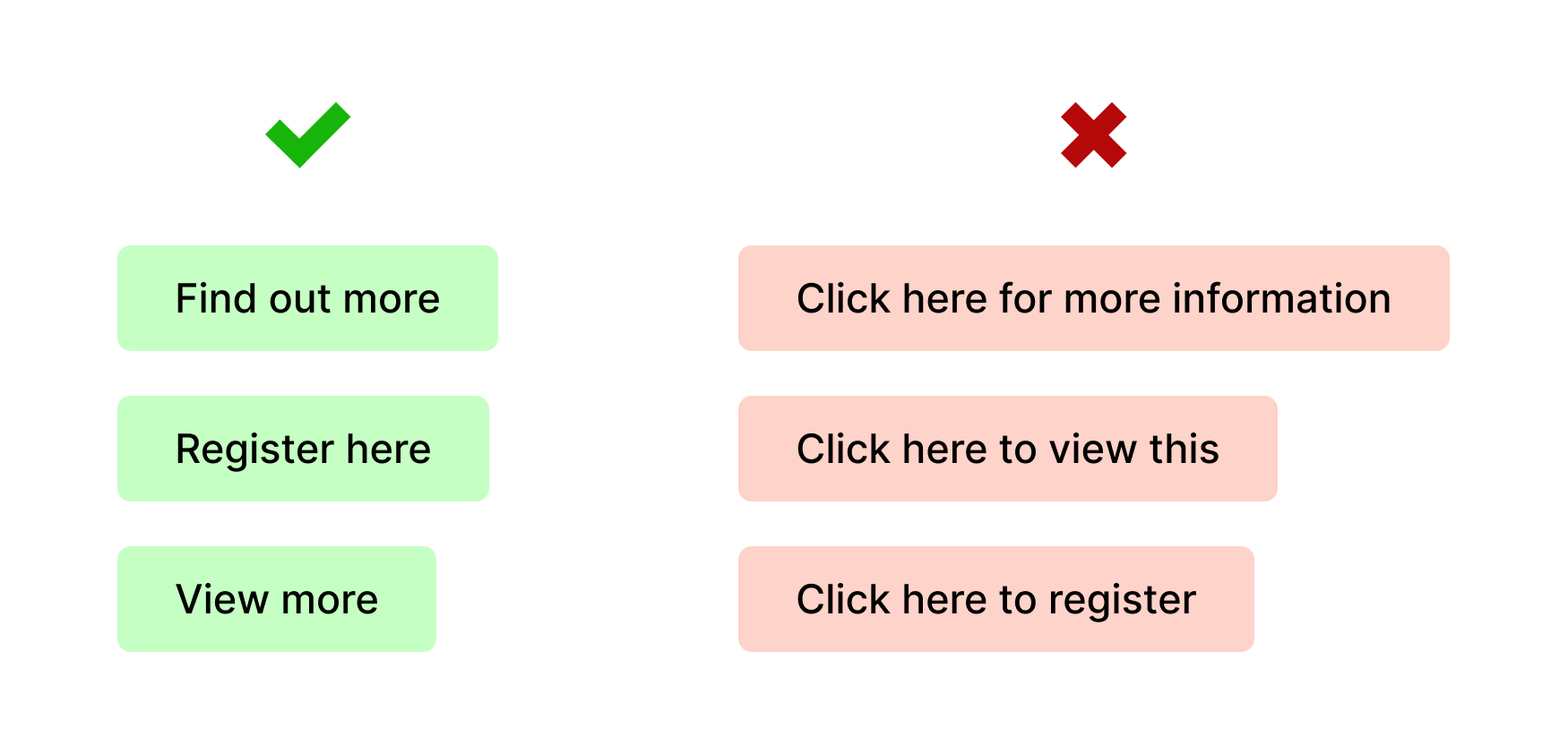
Keep button names within 3 words. Users may avoid reading it if it’s too long and it can even break awkwardly on smaller screens (e.g. on a mobile browser). Keep it short, sweet, and to the point.
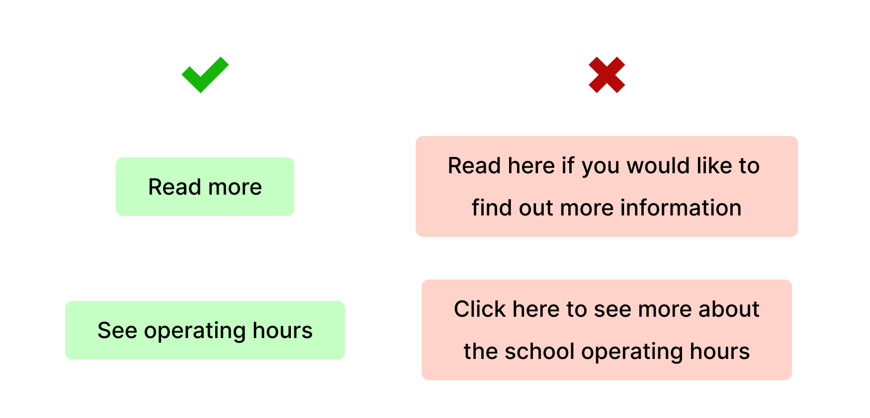
7. Provide descriptive names for hyperlinks
It’s okay to link to multiple words in a hyperlink (as compared to buttons, where you should limit to 2-3 words).
Try and link the most important part of the sentence, such as the item that the hyperlink leads to. Similarly, avoid linking to vague texts like “Click here”.
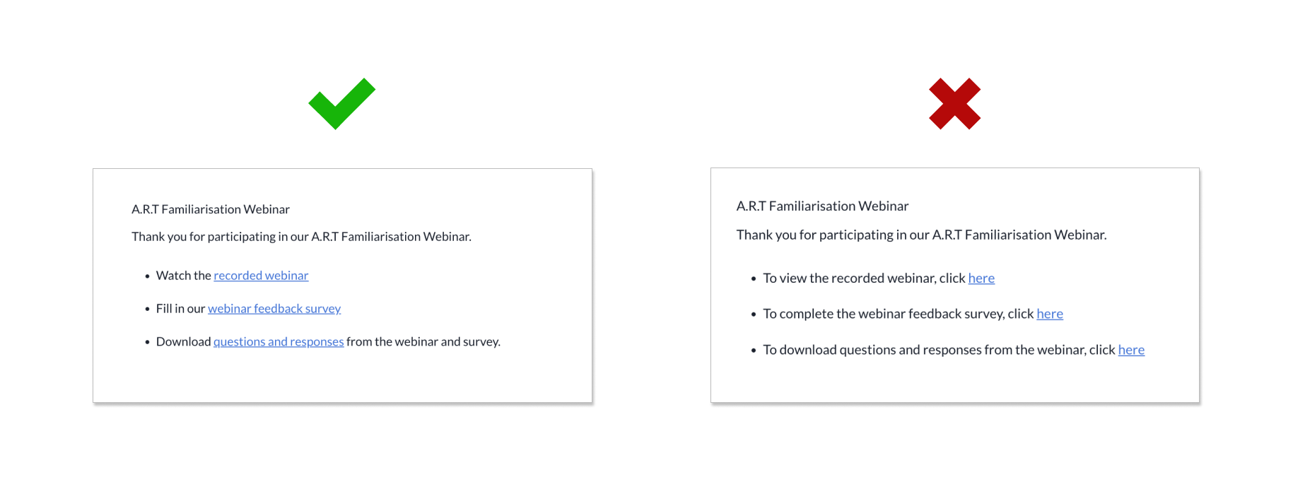
Comparing both examples, the ones on the left are much easier to scan through as their hyperlinks directly show users what they would be clicking on (e.g. webinar or survey), as compared to the other example which only hyperlinks the word “here”.
Descriptive names are also important from an accessibility standpoint. Accessibility features such as screen readers often navigate from link to link, skipping surrounding texts which makes its users lose out on contextual information. As such, general terms like “click here” are not useful to such users.

