Text Content Design
About the module
This module discusses the importance of proper text formatting and practices, such as using text hierarchies, paragraphs, and lists.
Importance of text content design
Besides the homepage, other pages on Isomer mainly displays text content through the markdown editor. The markdown editor allows users to format texts through elements like lists, headings, and bolding.
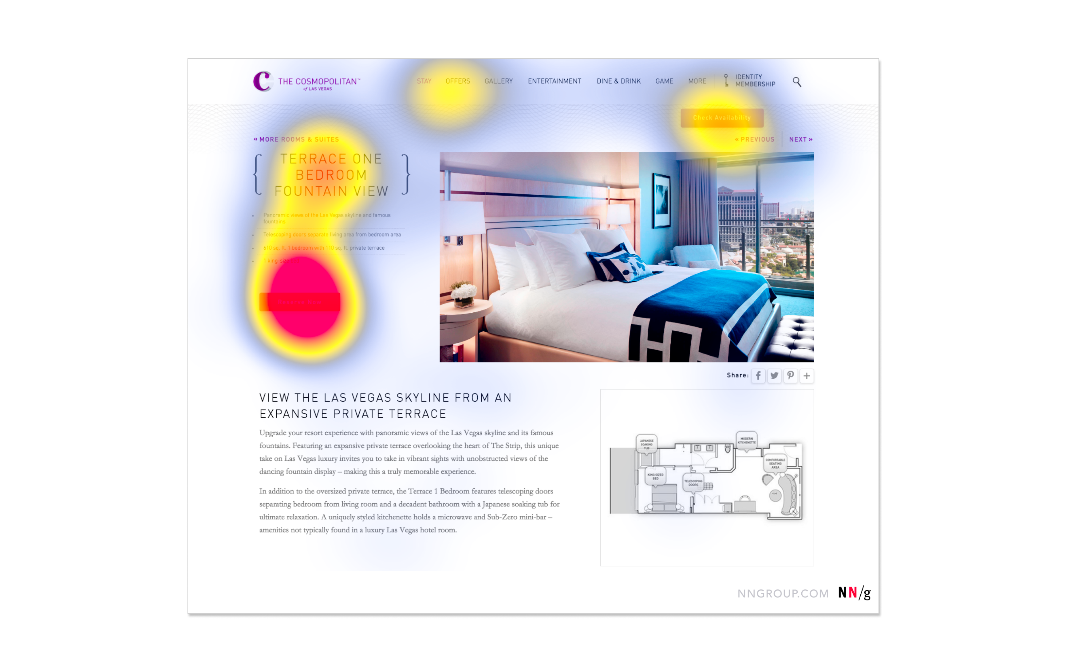
Although these pages mainly handle only text content, how these texts are structured can heavily impact content readability and user experience. Contrary to what most people think, most users only do a quick scan across the page to read texts that are relevant to them.
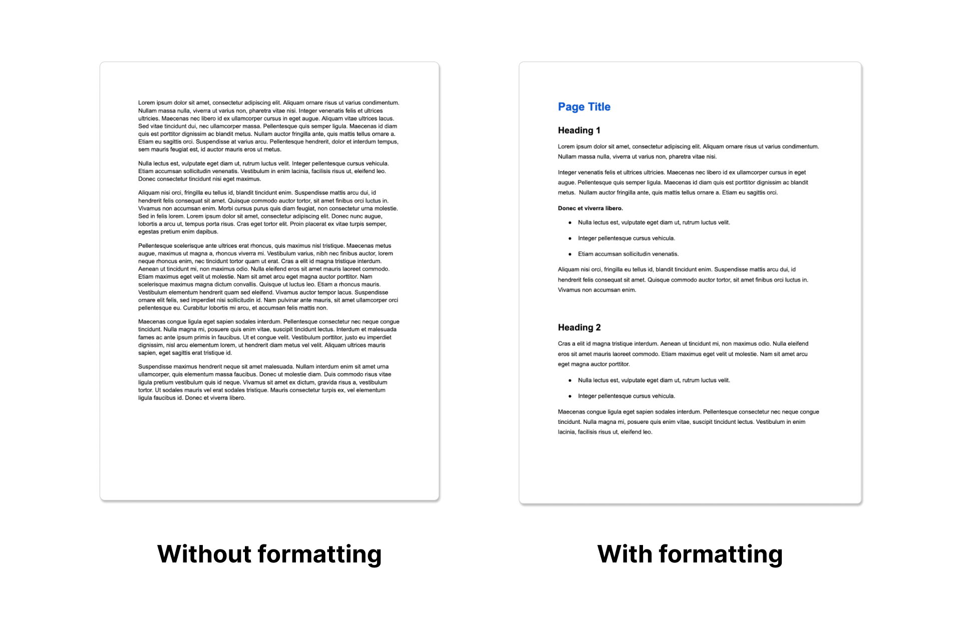
Comparing both examples below, you can see how a webpage formatted with proper headings and paragraphs is much easier to read than one containing just text.
This example above shows a heatmap of how users typically scan a page, taken from an eye-tracking experiment by the Nielsen Norman Group. Users are focused on specific areas of the page, particularly titles or emphasised texts. These examples show how text content design impacts the users’ behaviour on a page.
Key principles for text content design
1. Well-organised
- Content should be structured logically, in a way that makes sense to users reading from the top to bottom of the page. Headings, images, and hyperlinks used should complement your texts.
2. Easy to scan and read
- Include proper headings and titles to make it easy for users to scan through the page. Split up different content points into different sections. Break large amounts of texts into shorter paragraphs and sentences for better readability.
3. Easy to understand
- Written content should be easily digestible and understandable, even without prior context. Avoid making your content too technical or including jargon.
Best text content design practices
1. Write meaningful headings
Headings are titles or headlines located at the start of a paragraph, that are used to break up text content. This helps structure the page into smaller sections that are easier to read and navigate around.
Instead of generic headings (e.g. more information), write relevant headings that describe the content in the following paragraph.
Headings should be understandable without context, which allows users to scan through the page and jump into sections they need to easily.
2. Create effective text hierarchies
There are 5 levels of headings (H1 to H5), ranking in order of visual prominence and importance.
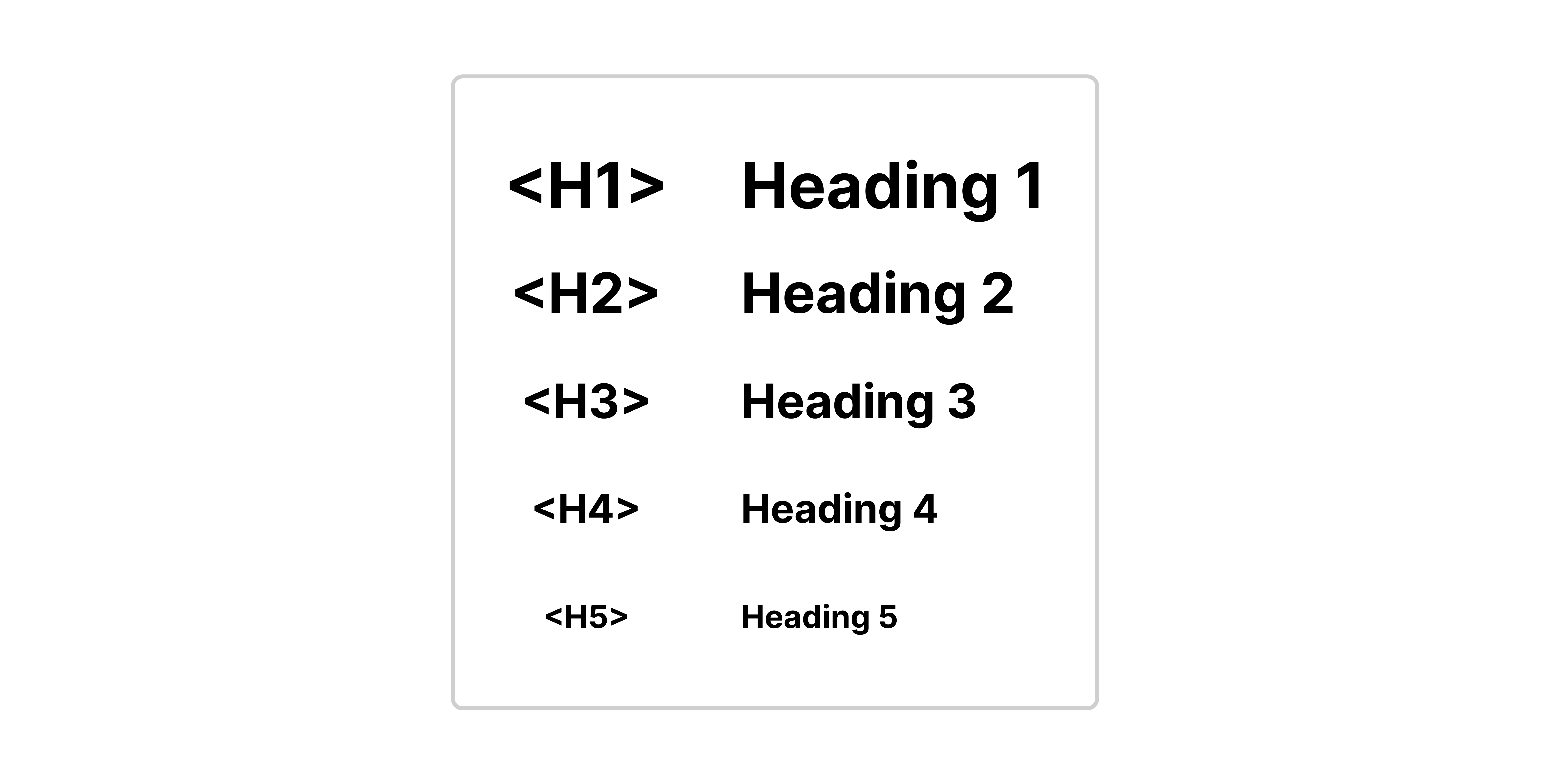
H1 headings are often used to convey top-level ideas, followed by H2-level headings for their sub-sections. These sub-sections can then be further sectioned with H3 headings and so on.
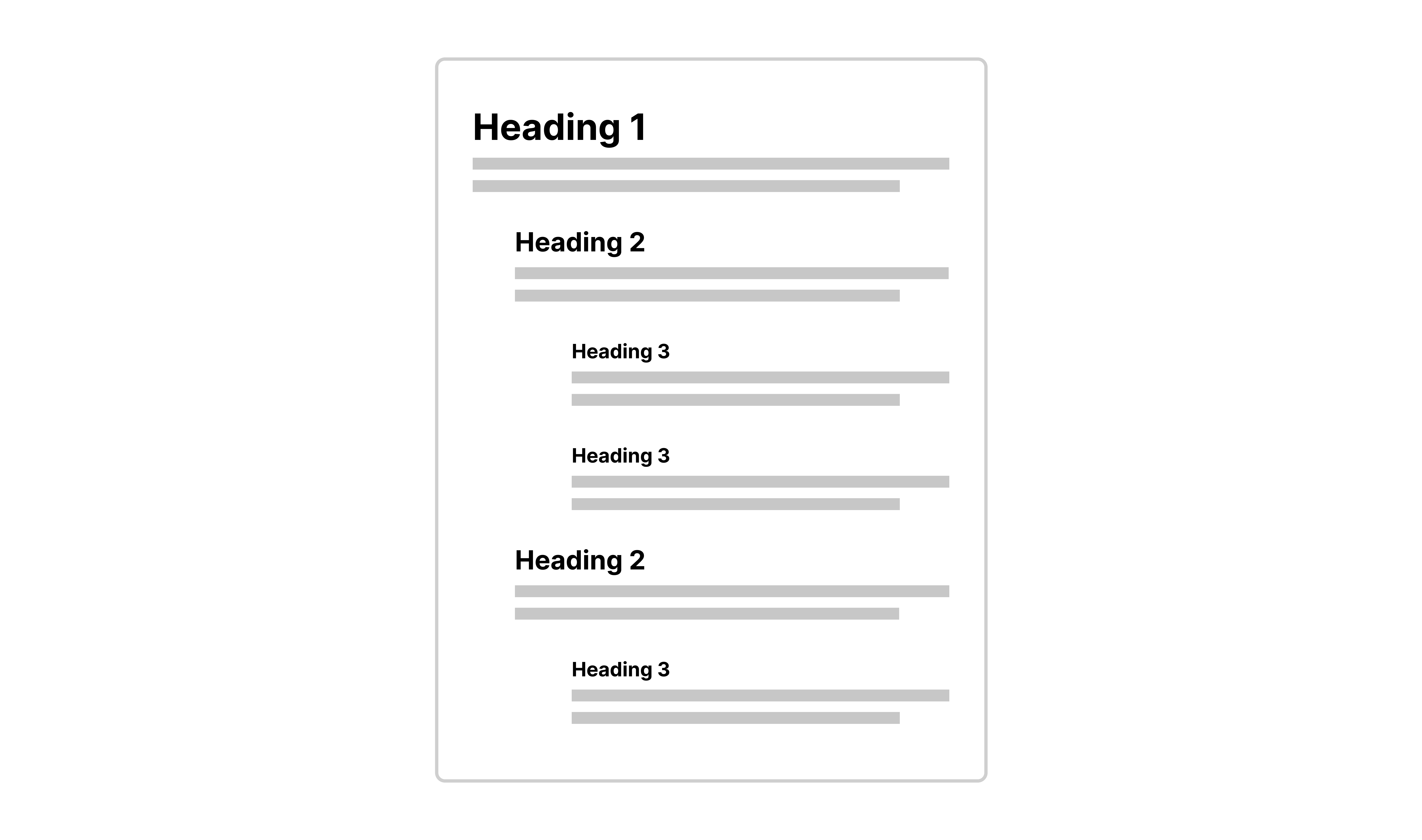
In the example above, we see how H2 headings are nested below H1 headings to create different sections. Within these sections, H3 headings are used to create more sub-sections.
Text hierarchies visually portray a relationship between the different sections, and help users to understand how each section is nested between one another.
Breaking up pages into clearly defined sections allows users to get an overview of the page’s content and quickly get to the part they need.
3. Break up content using paragraphs
Paragraphs are useful in breaking up large chunks of text and helping to make your content easier to scan. Keep your paragraphs short as having a wall of text is intimidating for users to read.
4. Use of bulleted and numbered lists
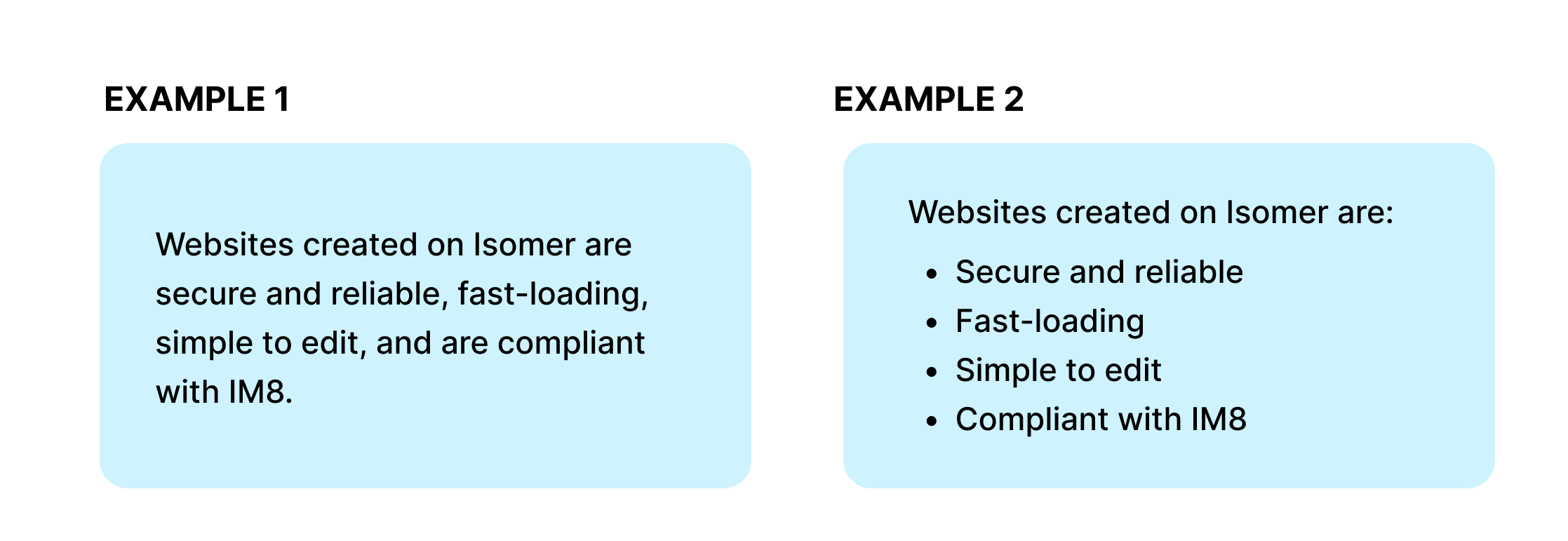
The list is a useful element for breaking up chunks of text, shortening texts, and suggesting relationships between different items. Take a look at both examples below. Having a list makes the content on the right more digestible.
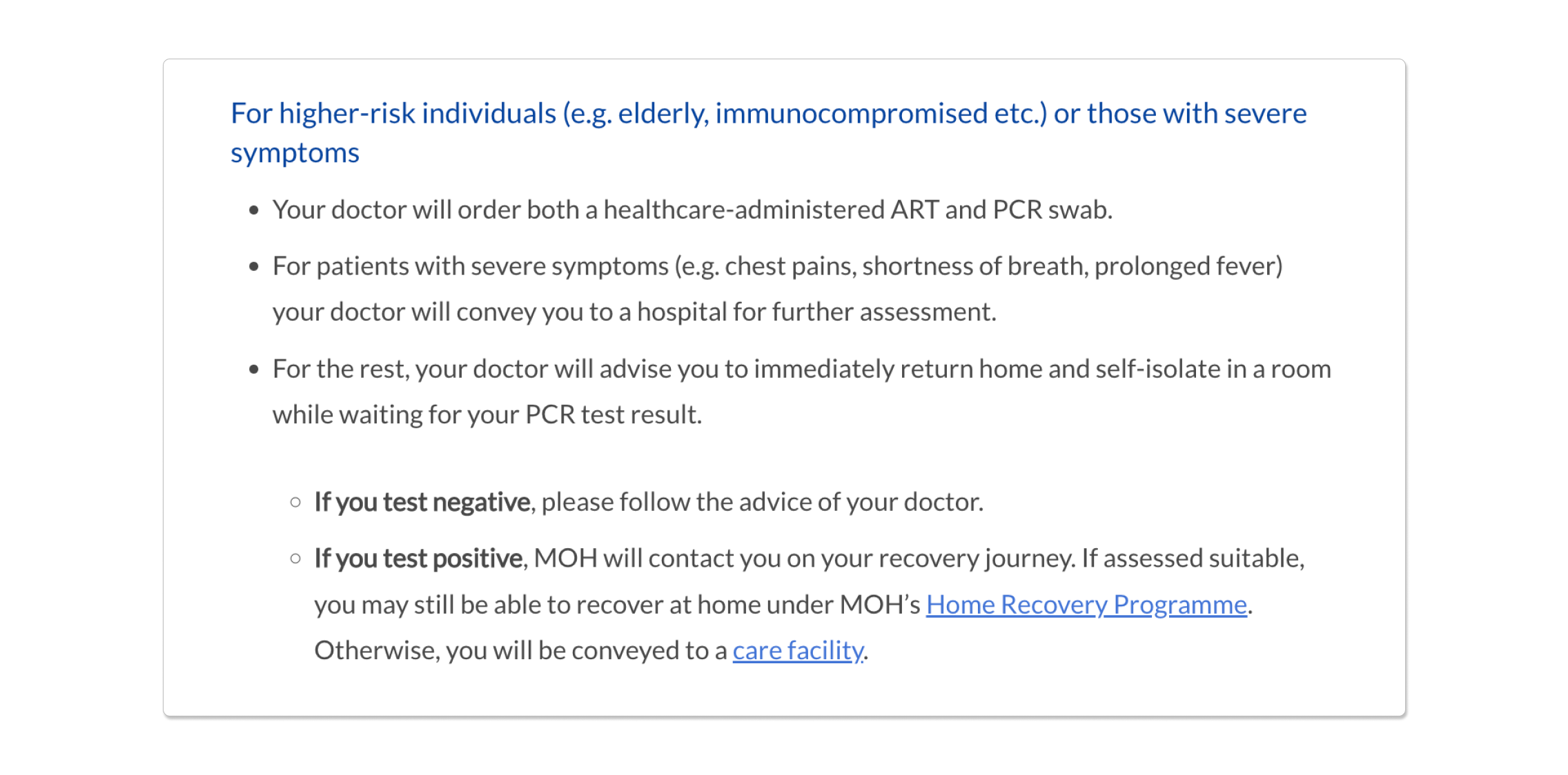
For more complex lists, you can further create sub-pointers within your pointers if you need to present more information.
5. Provide descriptive names for hyperlinks
Make sure hyperlinked texts describe what the link is about. This helps users to know what to expect when clicking in. Avoid linking to vague texts like “Click here”.
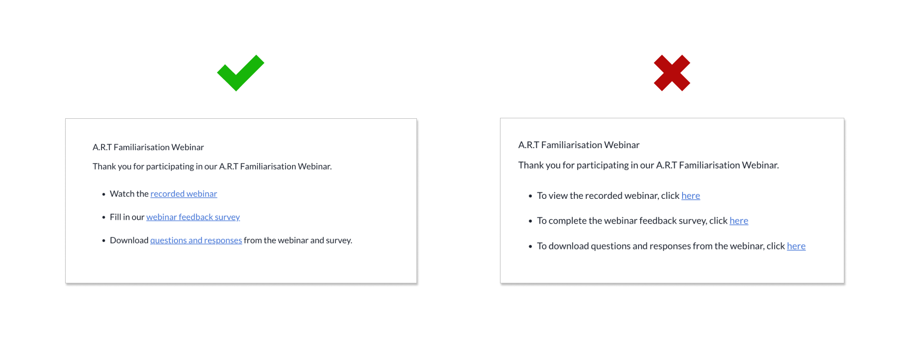
Compare both examples, the examples on the left are much easier to scan through as the hyperlinks directly show users what they would be clicking on (e.g. webinar or survey), as compared to the other example which only hyperlinks the word “here”.
Descriptive names are also important from an accessibility standpoint. Screen readers often navigate from link to link, skipping surrounding texts and making its users lose out on contextual information. As such, general terms like “click here” are not useful to such users.
6. Emphasise important texts
The use of bold text is great for adding emphasis to important words or phrases. Bold texts help break up monotonous texts and make them easier to scan.
By bolding keywords or texts at the start of important sentences, you can effectively direct the user’s attention to that particular point.
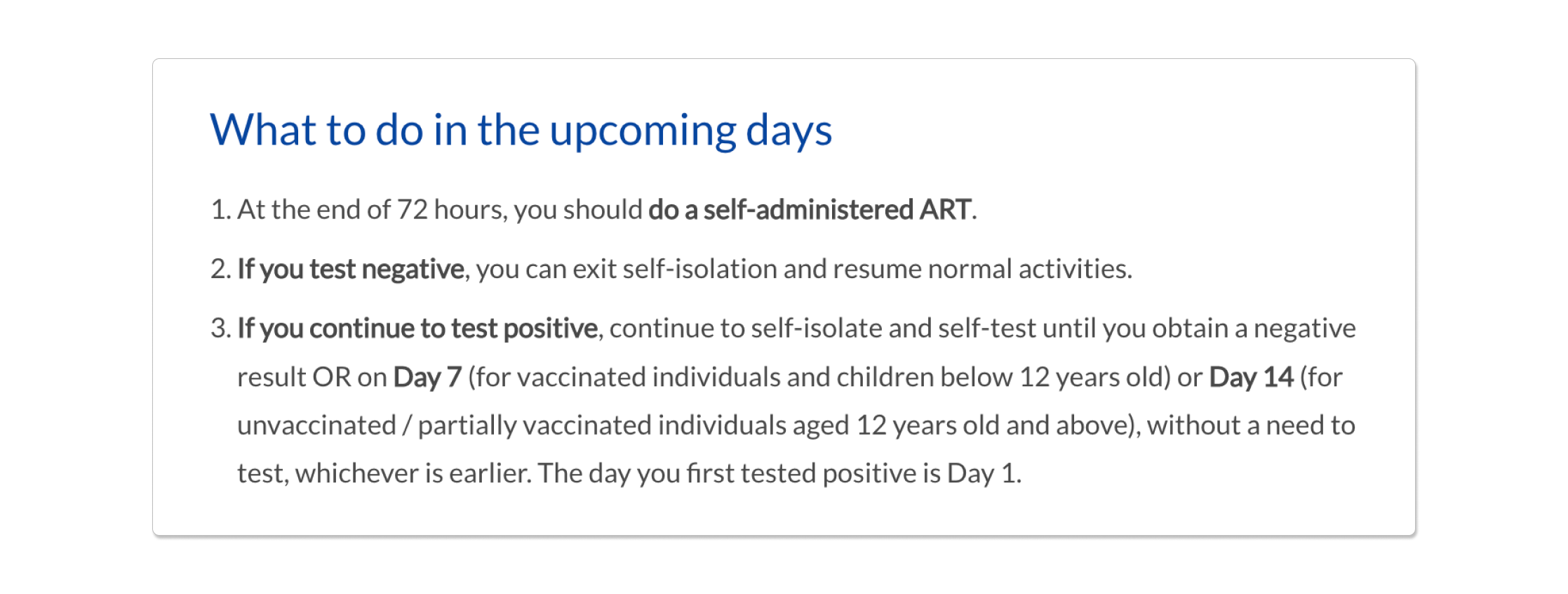
The example above shows how the bolded texts of “if you test negative” and “if you test positive” helps users to easily scan through the page as they can just skip past the parts that are not relevant to them.
However, be wary of over-using bold text as it can quickly lose its effectiveness and instead make your content difficult to read.

