Website Navigation
About the module
This module touches on how to better structure website content and navigation, such as grouping pages into categories or setting proper navigation headers.
What is website navigation?
Website navigation refers to the way a user clicks across a website to find what they need. For example, navigating through different pages on the website to find the “Contact Us” page.
The main factors that affect a user’s website navigation experience include:
-
How content on the navigation bar is structured
-
How different pages are categorised and grouped
Imagine that navigating through a website is like shopping at a supermarket. In this example, the supermarket represents the website, and the customer represents the user.
- The customer goes to the supermarket to look for canned soup.
- Once inside, he starts scanning for signs that lead to the different departments in the store, such as “Food”, “Cleaning”, or “Appliances”.
- The customer heads over to the “Food” department accordingly.
- The “Food” department further segments into separate aisles like “Fresh food”, “Condiments”, and “Instant food”. The customer heads toward the “Instant food” aisle containing the canned soup he is looking for.
As shown in this example, well-structured department signs and product categories are essential to ensure that customers can quickly scan through the supermarket to get to the area they need.
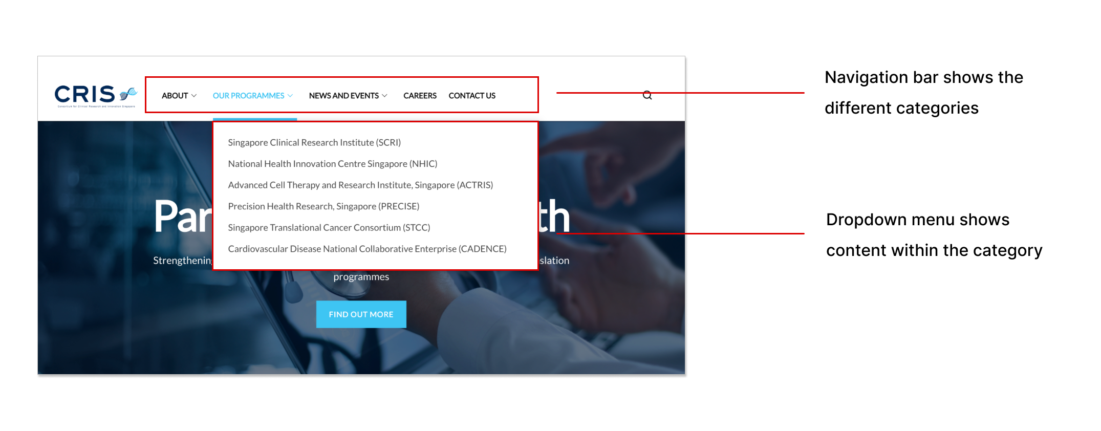
This is similar to a user’s thought process when navigating through a website, where they would first scan through the headers on the navigation bar for a broad overview of the website’s content, then hover over the dropdown menus to look at the items within.
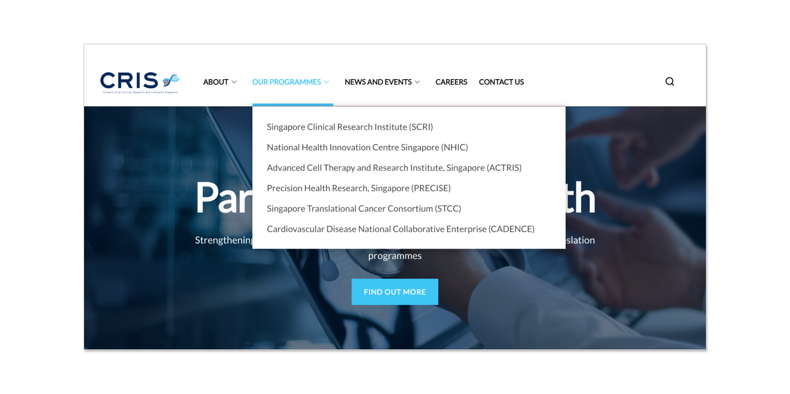 Example of how a navigation bar and its dropdown menu work
How does website navigation work?
Websites typically consist of many different pages grouped into broader categories for users to easily scan through.
For example, pages featuring “Children’s Day Celebration”, “Christmas Party”, and “New Year’s Countdown” can all be grouped together under an “Events” category.
Here is a visual example of a website’s layout across different categories and pages.

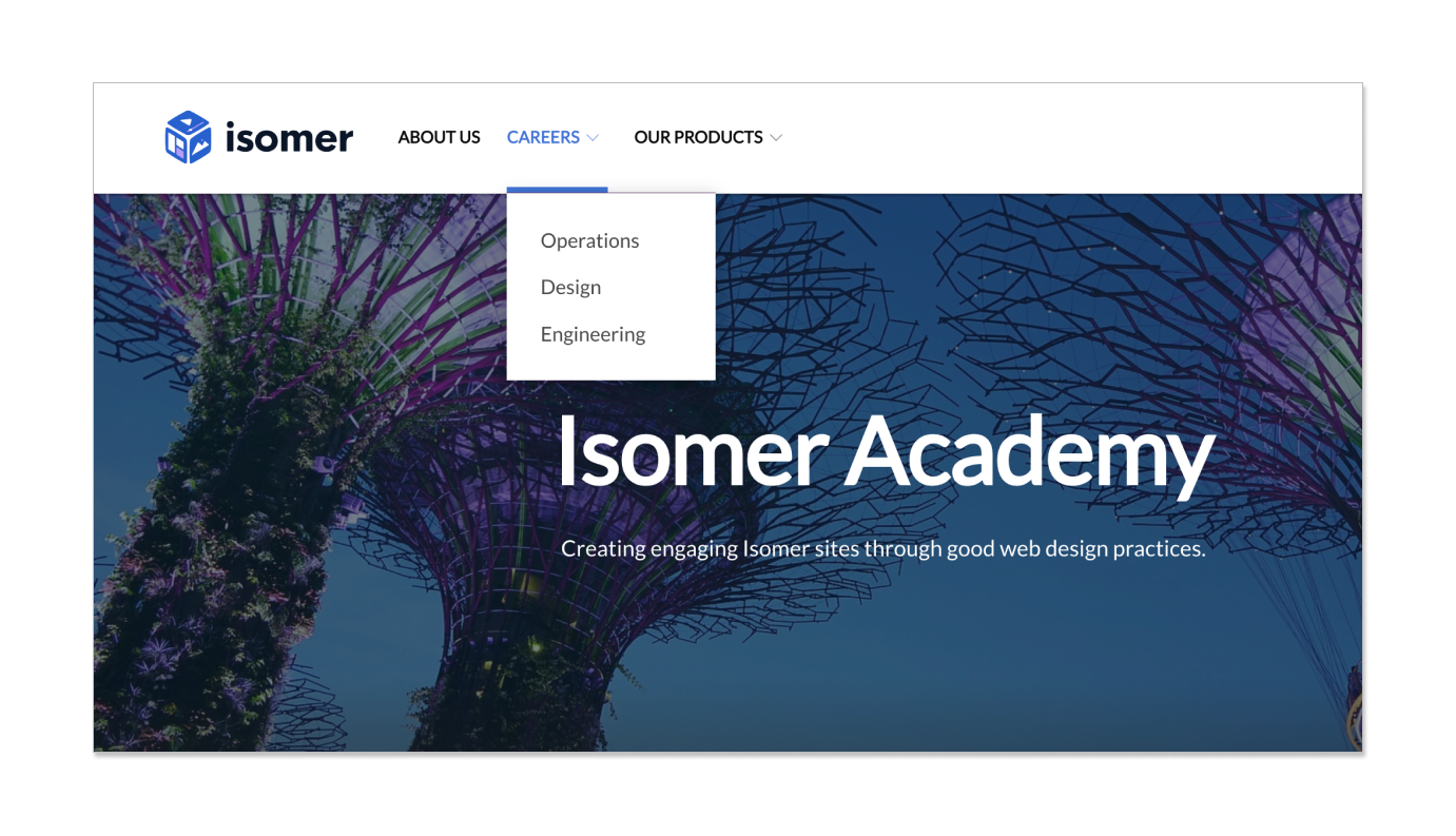
These categories will be displayed as headers on the navigation bar for users to easily access, as shown below.
Why is good website navigation important?
Well-designed website navigation is a big factor in good user experience as it allows users to find what they need independently and easily.
A good website experience not only leaves a favorable impression of your overall brand but also encourages users to stay on it longer to browse through other content. This would lead to an increase in key metrics such as user retention rate and visit duration.
Conversely, a website with bad navigation can leave users frustrated as they are unable to find information easily, which could cause them to “bounce”, exiting the website without taking any action.
Key principles for good navigation
Clearly defined categories
- Avoid making users guess what the items on your navigation bar mean or what pages may be in it. Headers on the navigation bar on your website should be intuitive and easy to understand.
Proper content grouping
-
With how website navigation works, it is clear that the way content is grouped plays a big role in the overall experience. A mislabelled category or misplaced page can confuse users or hinder them from finding what they need.
-
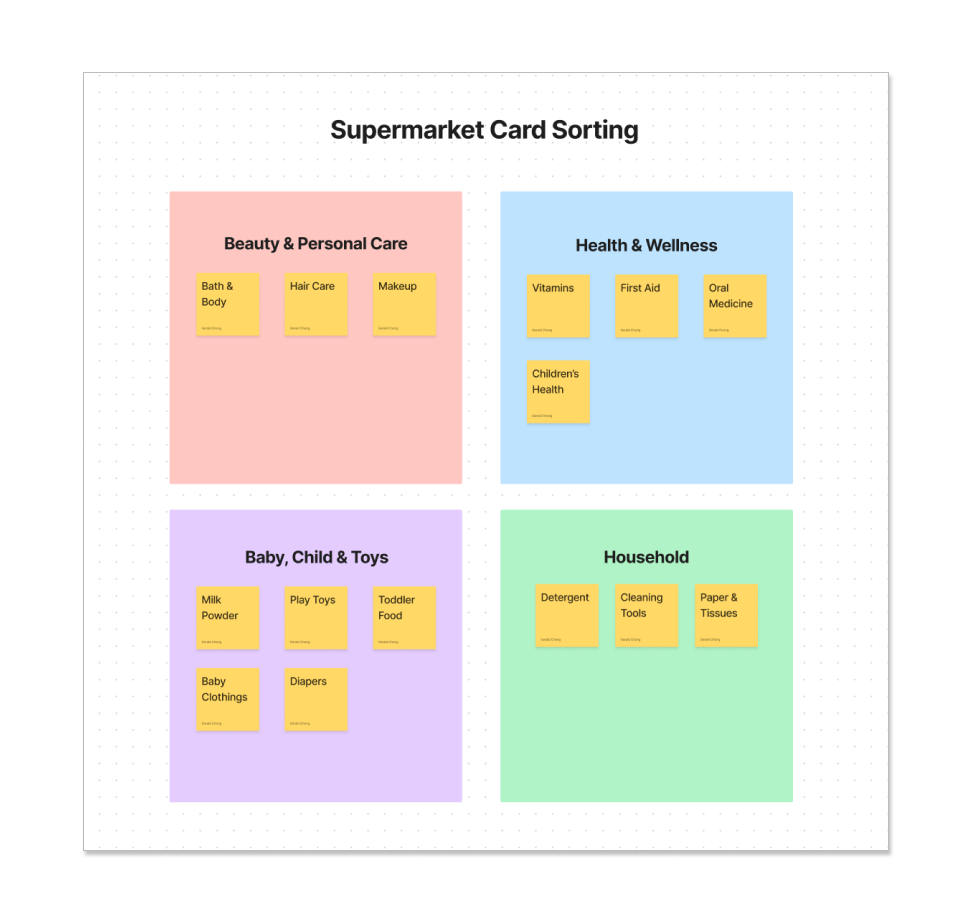
A card sorting exercise can also help teams to fully align with what their users think. This involves getting their users to sort different items under matching categories, as shown in the example below. This allows teams to observe and better understand how their users think.
User-tested approach
- A good way to ensure that the navigation experience on your website works is simply to try out your website with users.
- Come up with a simple task list for them to go through (e.g. find contact details) and observe as they go through the website. Note down any issues that they face throughout the process and discuss their experience at the end.
- Another way is to regularly check in with your users through surveys or feedback forms.
Designing the navigation bar
A well-structured navigation bar is essential for every website as it is the first element users would go to for information and what they rely on for website navigation.
As explained above, content on a website can be grouped into different categories. These categories would be shown as headers in the navigation bar. Hovering over these headers further displays the contents within it.
Avoid placing too many headers
- Headers on a navigation bar should be used meaningfully for broad categories. Having excessive headers makes it more difficult for users to know what to click on. Similarly, do not include too many items in the dropdown menu as well.
Keep headers clear and distinct
- Avoid having overlapping headers as it is confusing. For example, placing similar headers like “events” and “activities” would confuse users who are finding for a page like “Children’s Day Party”.
Skip the “home” header
- A “home” header is unnecessary in the navigation bar. Users understand that clicking on the logo would lead them back to the homepage. Make use of the space for other headers instead.
Examples of navigation
Aside from the navigation bar, you can also make use of hero banner highlights and hero banner dropdowns to provide alternative ways of navigation for users.
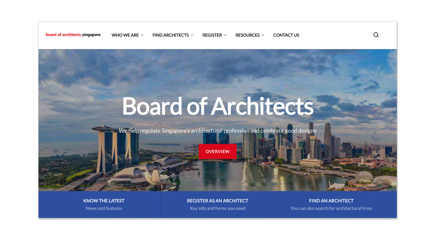
The Board of Architects’ website uses the hero banner highlights to showcase 3 key actions that users can take - getting information, registering as an architect, or finding an architect.
VITAL uses the hero banner highlights to target different user personas (corporate businesses, individuals, and potential partners), allowing users to navigate according to their needs.

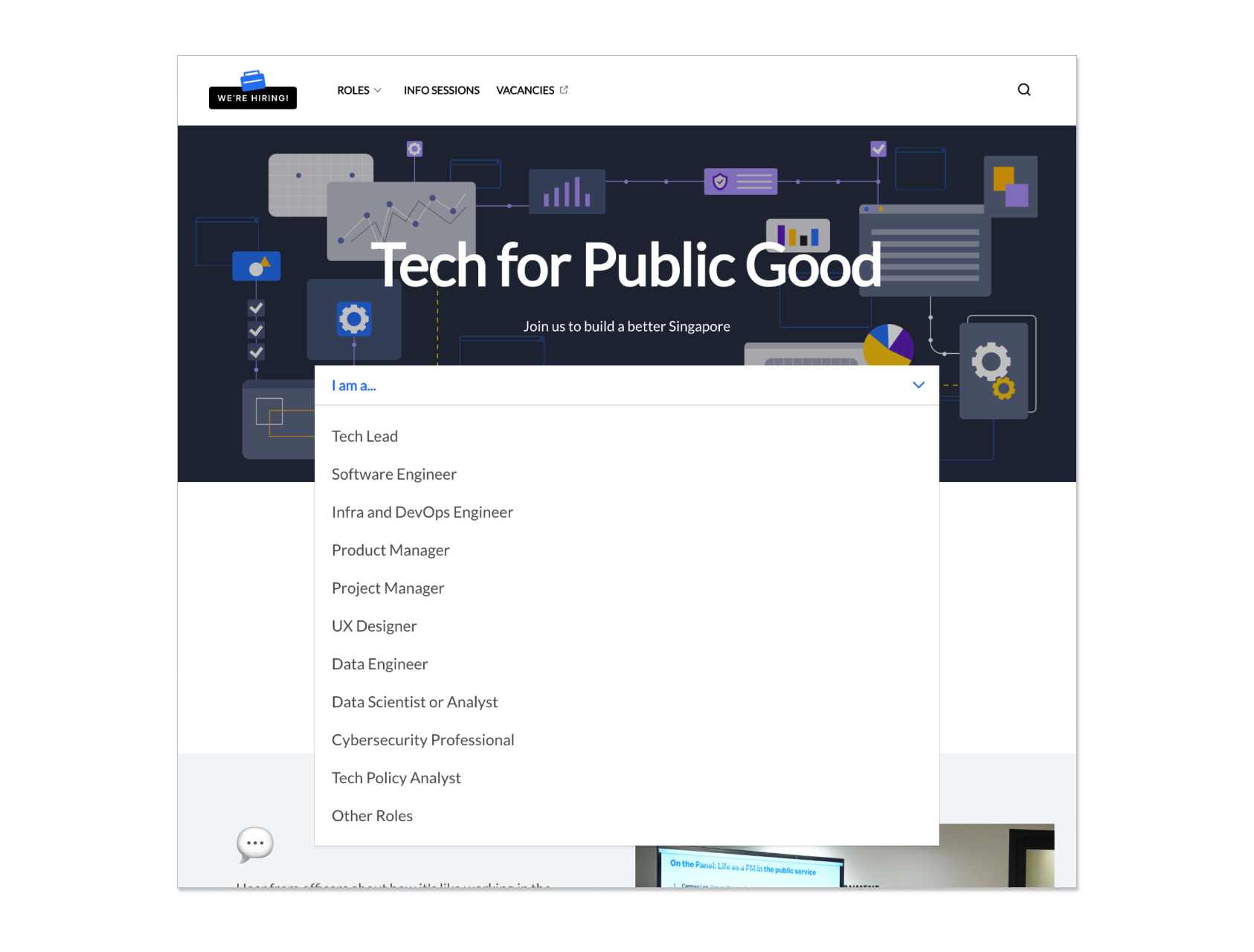
Open Government Product’s tech hiring website utilises a dropdown menu in its hero banner to cater to a wide range of users as well. Users simply select the roles they are interested in to view the relevant information.
