Research Insights
This section contains specific research insights that are more relevant toward schools that are using Isomer. Research was done in August 2022.
Our Research for Schools
Over the past few months, the Isomer team has worked closely with both parents & school staff to learn more about their experiences with different school websites.
Through our research, the team uncovered many useful insights that we hope to convey to schools about the challenges that their users face. The following details the different research that the team has conducted.
Parent interviews
Conducted 20 interviews with parents to hear their thoughts, challenges, and experiences interacting with various school websites. Parents were asked key questions such as:
- What do you use the school website for?
- What are some difficulties faced on school websites?
- What do you prioritise in a school website?
School co-creation workshop
Hosted workshops for schools to co-create new Isomer ideas and templates with them. The team also went through a short lesson on good website practices with participants. Key observations from the workshop include:
-
Participants found the lesson on good website practices to be useful.
-
Noticed certain misconceptions and bad website practices by participants.
Key Research Insight
Role of the school website for users:
- To be a source of reliable information they can trust.
- To be a source of relevant and updated information for the latest happenings.
- To get a feel of the school’s culture, identity, and offerings.
What type of information do users look for on school websites?
- Timely information (latest news, announcements, upcoming events)
- Operational information (opening hours, contact info, important links)
- School’s value proposition information (CCAs, school values/mission, offerings)
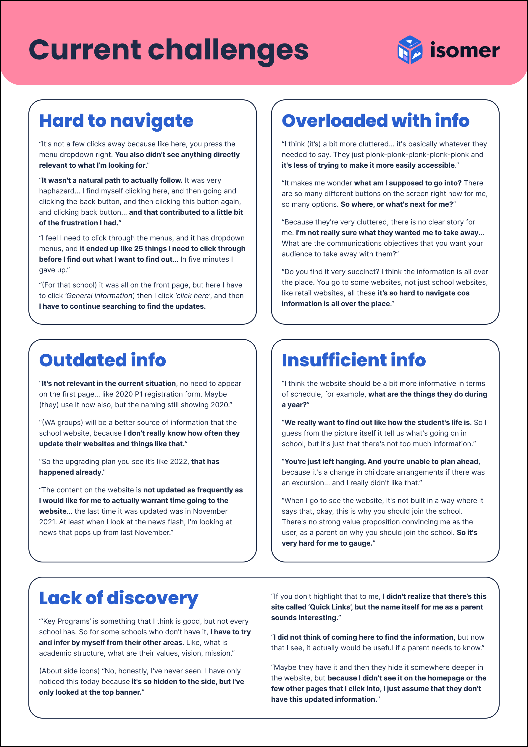
Challenges faced on school websites
Information is not shown upfront
-
Key homepage elements (e.g. navigation bar or buttons) are not shown clearly.
-
Users may also miss out on important content hidden behind sliders or dropdown menus. This makes the website difficult to use as information feels inaccessible and users have to put in more effort to get what they need.
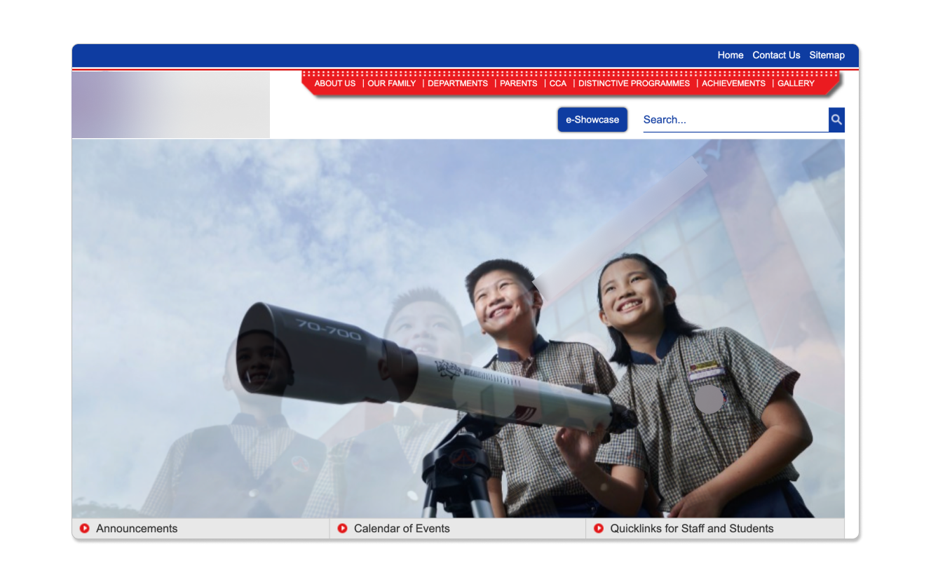 In this example, a parent mentioned that the navigation bar was not very obvious and that they were not sure what to focus on.
Excessive information on the homepage
- Having too much information makes it difficult to read. Users have trouble navigating around the page as they are unsure of where to click to get what they need.
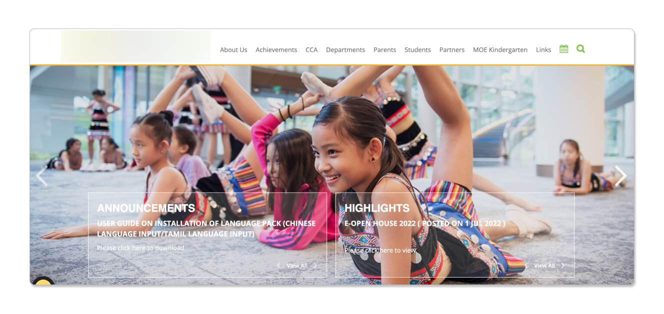 In this example, too many items on the navigation bar make it difficult for users to choose.
Information on the website is outdated or irrelevant
-
For example, things such as past events or outdated announcements are no longer useful to users and should be removed.
-
Such information clutters the homepage, making it difficult for users to find new information.
The homepage is not very helpful for users
-
Some homepages fail to include enough useful information upfront for users to browse through.
-
For example, some websites have pictures taking up most of their homepage. This may be visually engaging but does not help users get the information they need.
Pop-ups are a frustrating experience for users
-
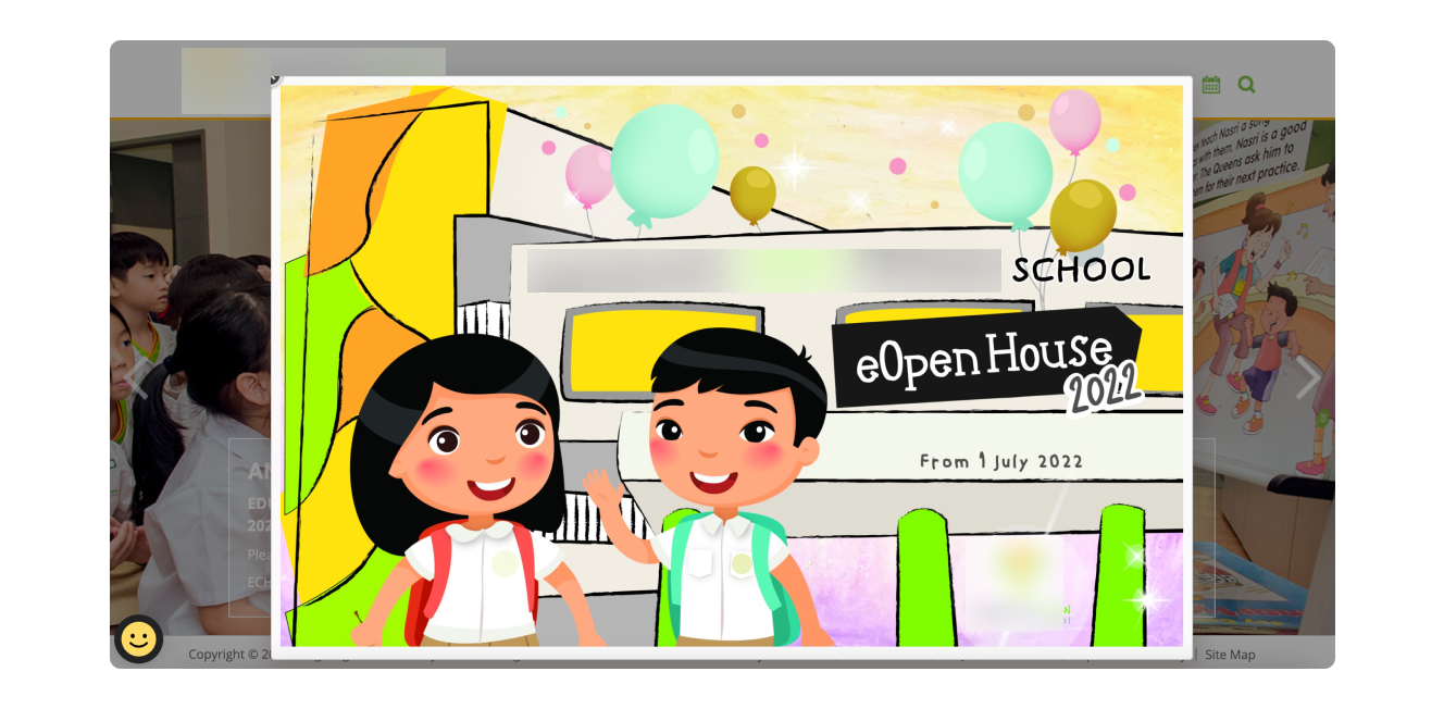
Pop-ups are intrusive as they force users to close them before they can proceed to where they need them. It also distracts them from finding what they want.
-
In most cases, pop-ups have not been coded properly, meaning they re-appear every time the user enters the site. This forces them to repeatedly close it every time they come back to the home page.
What users value in school websites
Ease of use and convenience
- Users want available information upfront so they can quickly scan for what they need on the homepage
Straightforward navigation
- Users value well-structured navigation headers as it helps them to navigate across the site easily and directs them quickly to the information they need.
Relevant content
- Users want information that is useful and relevant to their needs. Having irrelevant, duplicated, or outdated information does not help them.
Engaging & visual content
- Users value pictures and graphics to give better context and a better sense of the school environment and culture.
